The Luxer - digital identity design
Elevating the e-commerce experience for a luxury fashion group
LeadSparK - Mobile App

Context
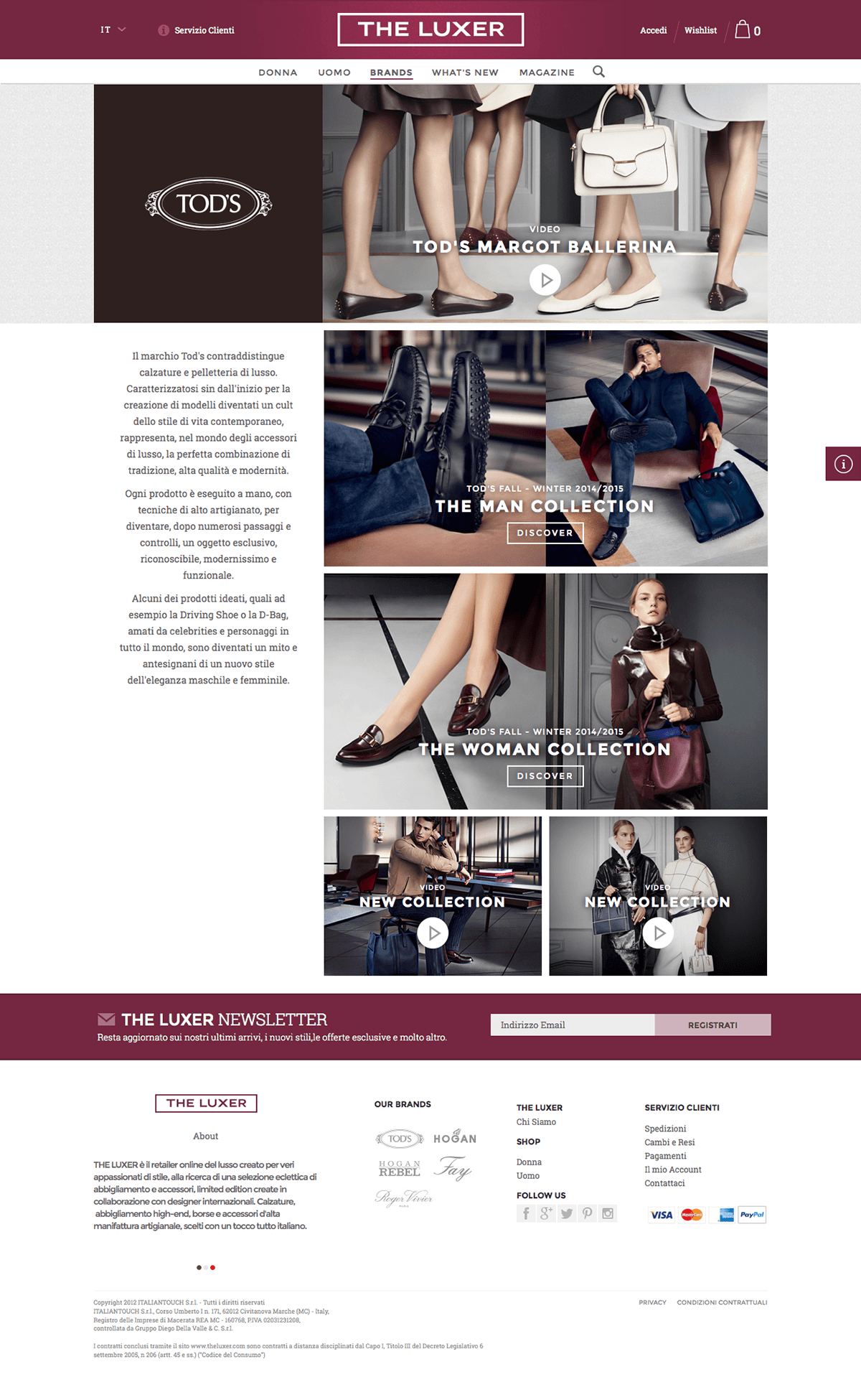
The Luxer is the official e-commerce platform for the Diego Della Valle Group, representing brands such as Tod’s, Hogan, and Fay. At the time of the project, the website no longer reflected the company’s brand positioning, nor did it offer a modern or engaging shopping experience.
The goal was to design the entire digital ecosystem, from layout to interaction, to better communicate the identity and values of the group while improving usability and visual consistency across all touchpoints. The scope included the desktop and mobile website, a complete set of editorial newsletters, and the creation of a digital style guide to ensure long-term consistency across content and future campaigns.
Client
Tod's group
Role
UI & UX Design
Industry
Fashion - Luxury
Date
2014 - 2015
Challenge
The challenge was to bring luxury and editorial storytelling into a responsive e-commerce environment, without compromising performance or clarity. The new visual language had to be elegant, flexible, and immediately recognizable, while supporting a wide range of content types and promotional formats.
The site structure and navigation logic also required a complete rethinking, aiming for a more intuitive and fluid experience, especially for mobile users. Furthermore, the final product had to serve not only users, but also internal content and marketing teams, giving them tools to maintain consistency without increasing complexity.
Design Process
UX and UI design
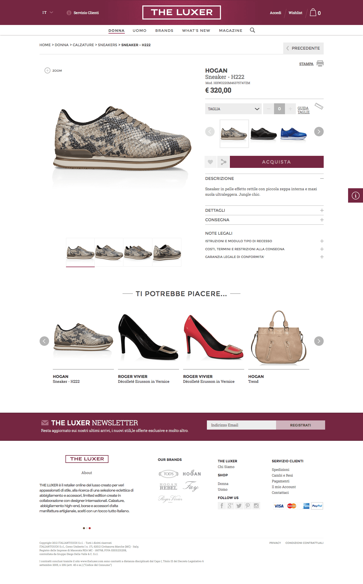
I reimagined the full navigation and layout structure of the site, focusing on:
Clean hierarchy for product and editorial content
Simplified browsing and filtering logic
Consistent CTAs and intuitive checkout flows
The experience was carefully optimized across desktop and mobile, ensuring that every interaction, from exploration to purchase, felt clear and seamless.
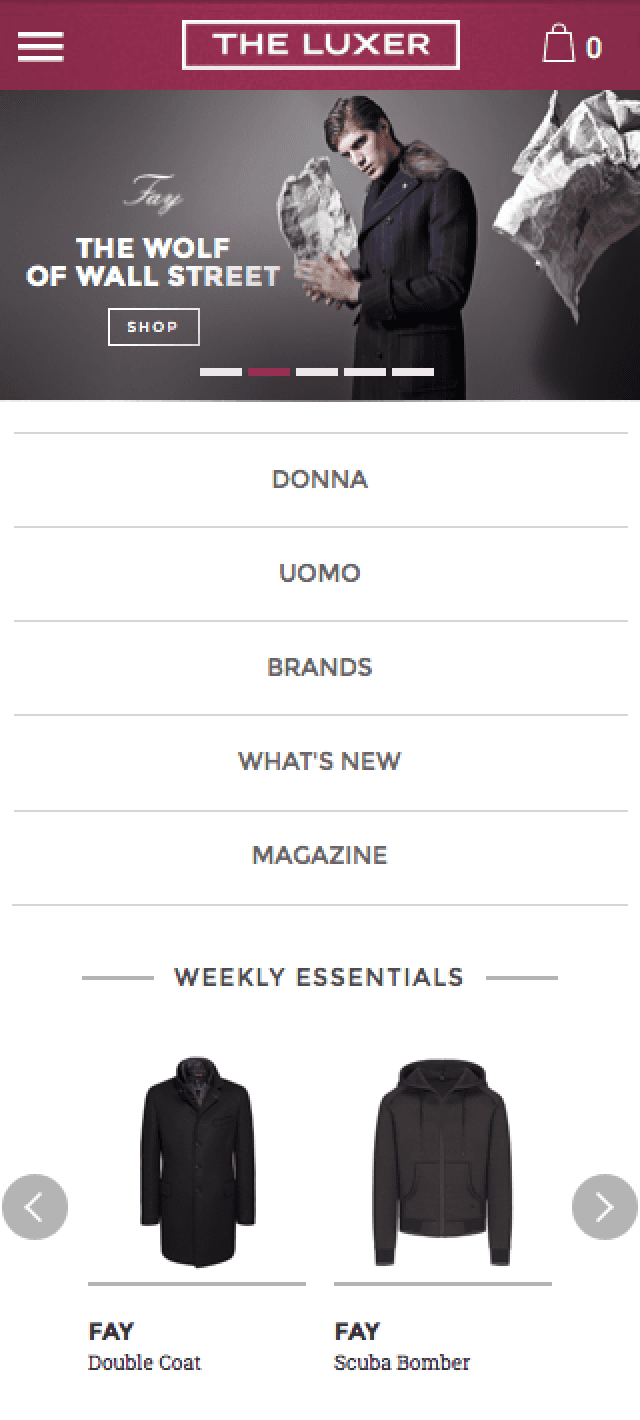
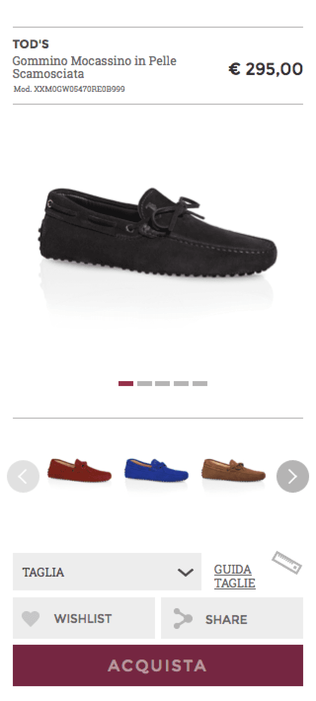
Mobile experience design
The mobile version was not an adaptation, but a dedicated design. I defined specific UI patterns for smaller screens, working on responsive interactions and ensuring consistency with the desktop experience in both aesthetics and usability.
Editorial system and templates
I designed multiple newsletter layouts and promotional formats to support The Luxer’s content strategy, combining fashion storytelling with high-conversion e-commerce blocks. These templates ensured editorial flexibility without sacrificing brand coherence.
Digital style guide
To support internal teams, I built a full style guide including:
Color system and typography
Iconography and CTA hierarchy
Editorial formatting rules
Layout grids and design tokens
This ensured long-term consistency, even across content updates or team transitions.
Cross-team collaboration
Throughout the project, I coordinated with developers, photographers, and content managers to align creative vision with technical feasibility, ensuring every animation, transition, and layout behaved as intended.
The design work also extended to creative content production. I designed editorial sections, developed illustrated assets, and shaped storytelling layouts to support seasonal campaigns and brand messages.
These visual contributions are documented separately in a dedicated case:
The Luxer communication


The Luxer E-commerce details
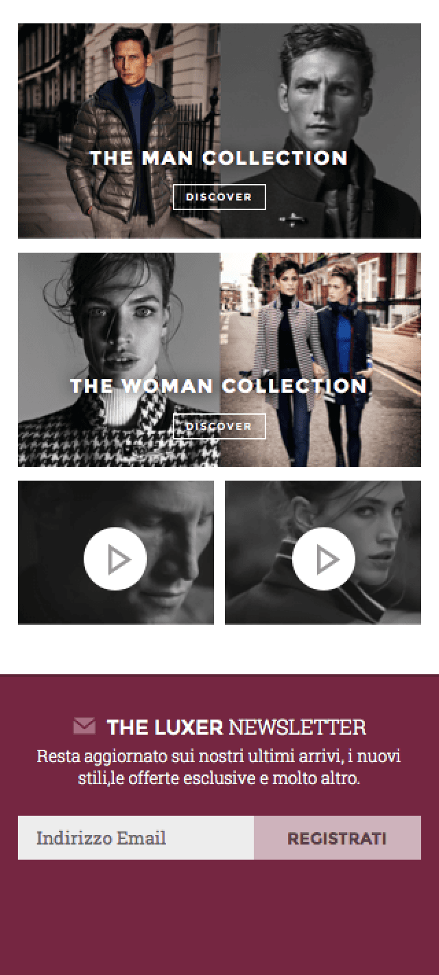
Mobile screens
Results Achieved
More intuitive navigation and better UX
The new structure improved product discovery and browsing speed across devices.
Stronger brand alignment
The new design visually expressed The Luxer’s premium positioning, balancing editorial and commerce.
Improved consistency across channels
From the site to newsletters and content, every visual asset now followed a unified system.
Higher engagement on mobile
A mobile-specific experience led to increased interactions and better retention.
Smoother editorial workflow
Internal teams gained tools and guidelines to manage content while respecting brands standards.
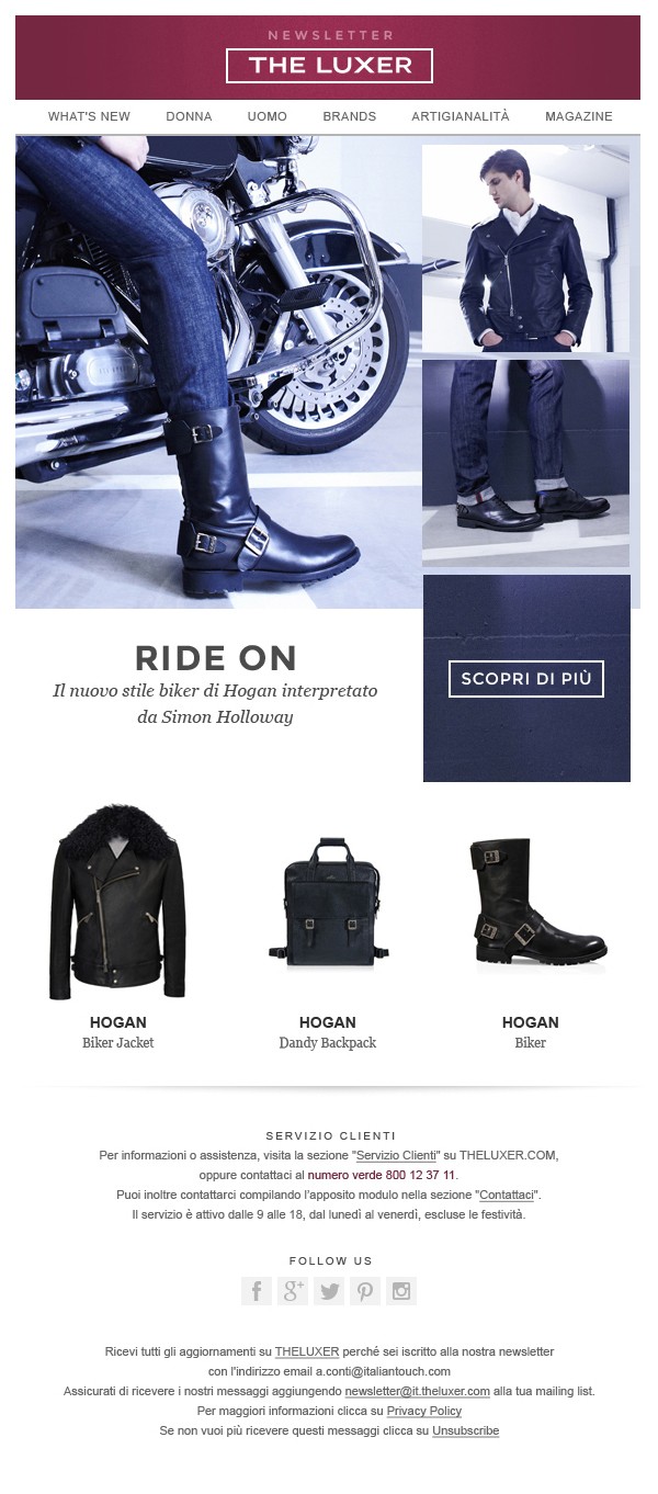

Email marketing templates design

Styleguide detail
Lessons Learned
Designing for a luxury e-commerce platform requires a continuous balance between form and function, visual storytelling and conversion. This project reinforced how important it is to create systems, not just screens: tools that empower not only the user but also the business and the teams behind it.
It also showed me how much impact comes from consistency at scale, when design direction, interaction logic, and editorial voice align, every part of the experience feels more intentional and valuable.