Motork Rebranding
A new identity for a new phase of growth
LeadSparK - Mobile App
Context
MotorK is a leading technology company in the automotive retail space, with a growing ecosystem of products and services. Over the years, the brand had become fragmented, logos, visual styles, and assets varied across products and touchpoints, weakening recognition and coherence.
The challenge was clear: modernize the brand identity to reflect MotorK’s evolution, unify the ecosystem under a cohesive system, and build a flexible design language that could scale across digital and physical applications.
Client
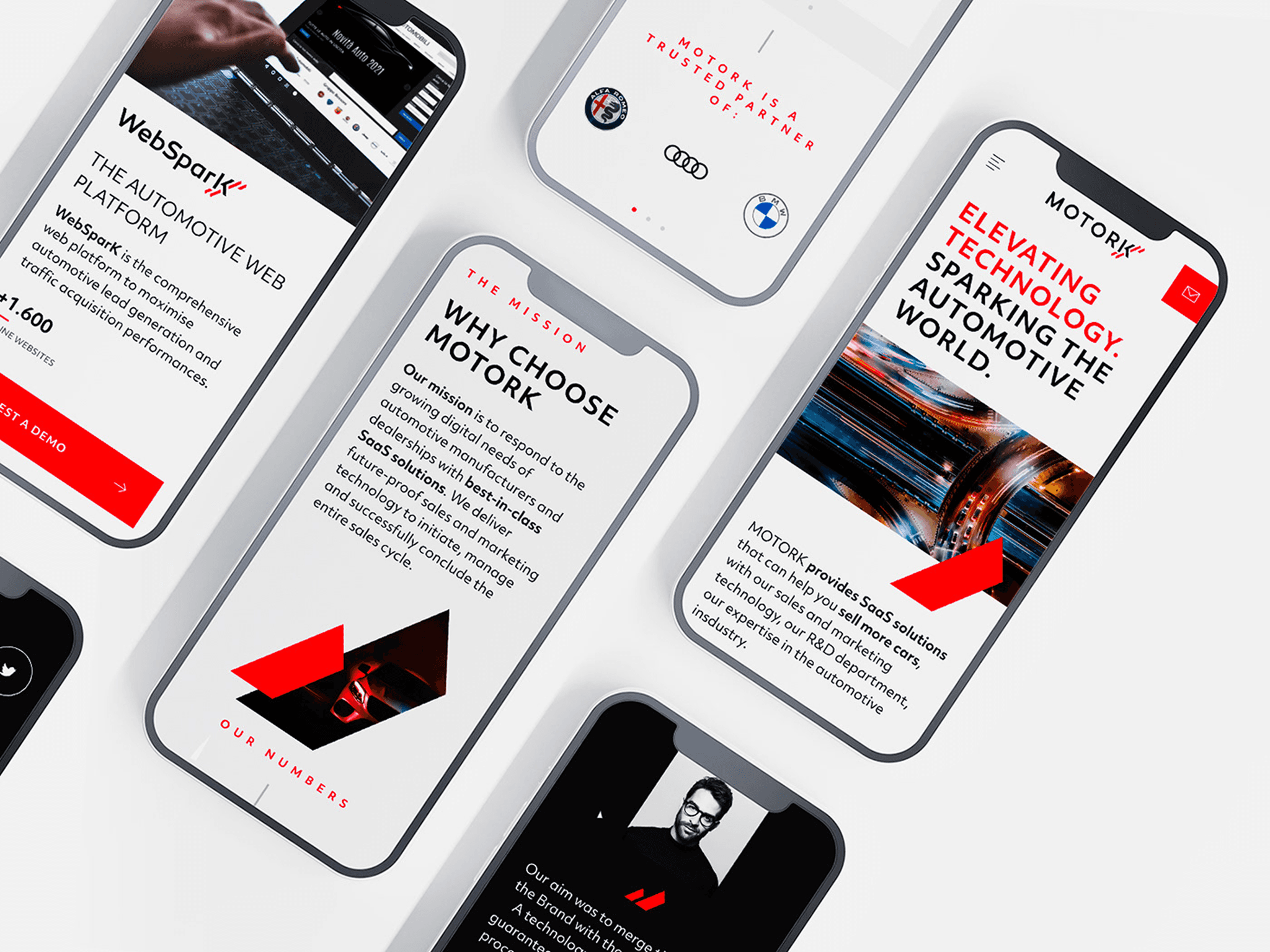
Motork
Role
Brand Design
Industry
Automotive
Date
2021
Challenge
The goal was to redefine the brand from scratch, with no sacred cows, questioning every element to create a system that could support the company’s next phase of growth. The new identity needed to feel more tech-driven, premium, and digital, while staying rooted in the company’s automotive DNA.
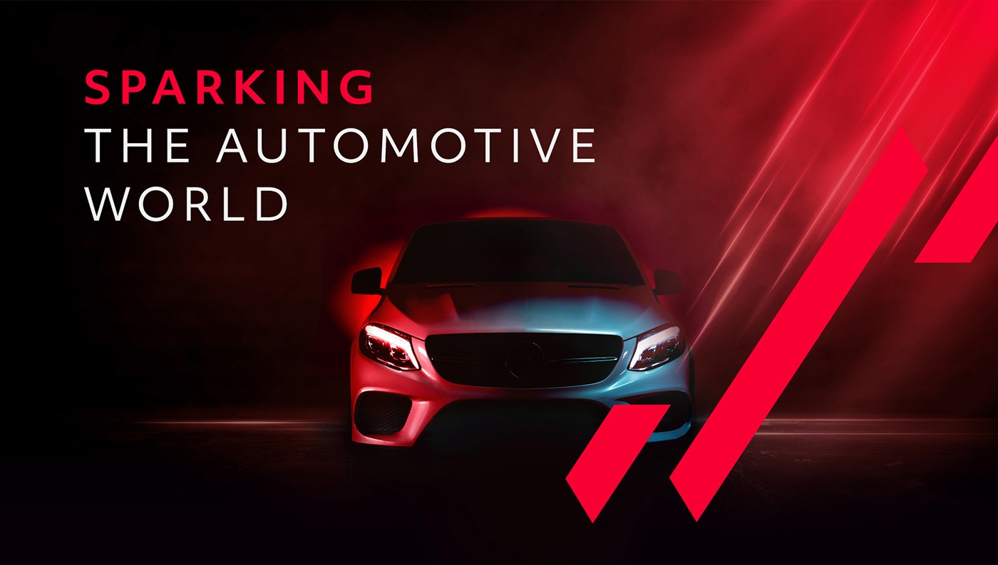
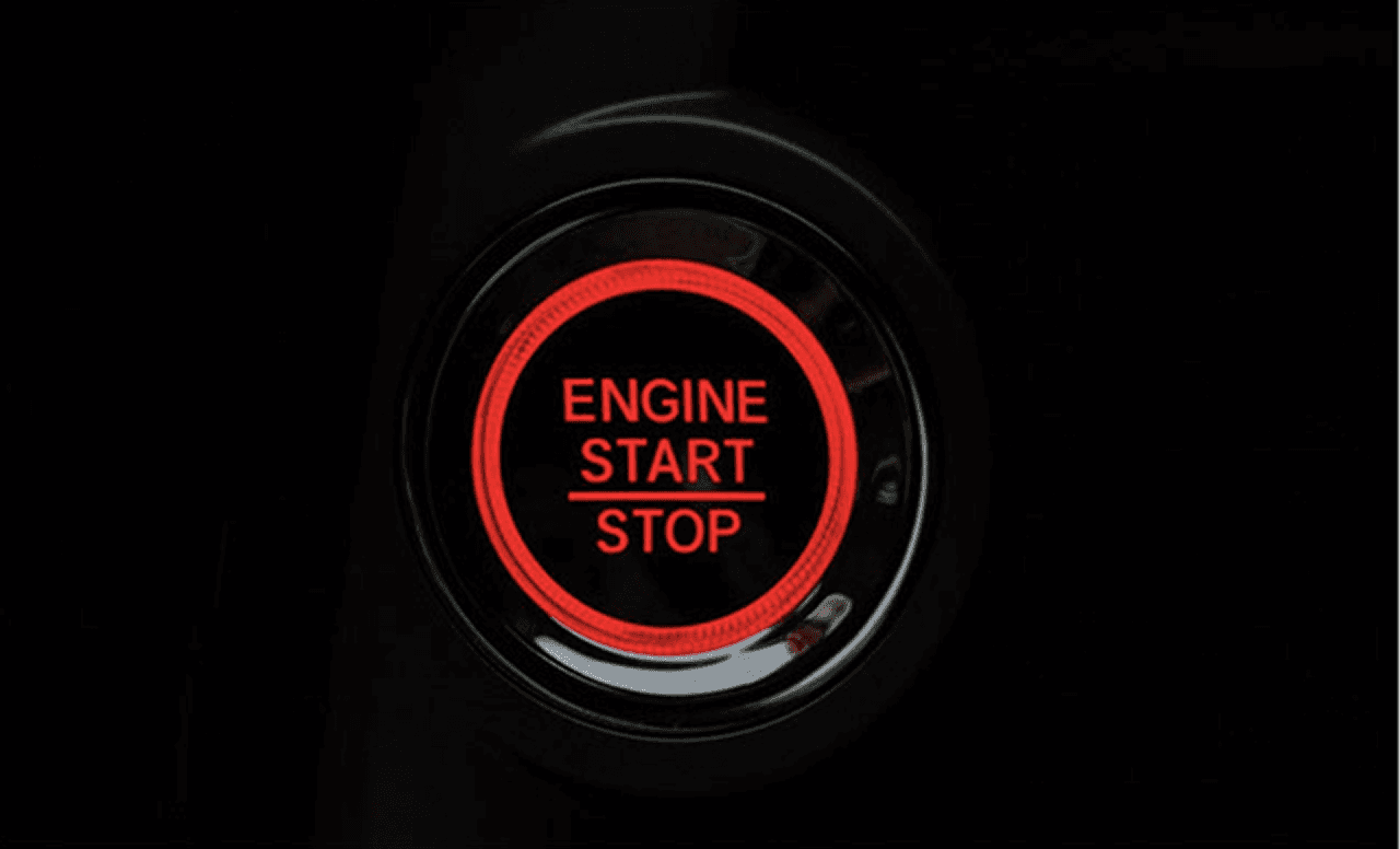
We centered the concept around the idea of a “digital spark”, a symbol of ignition, transformation, and speed. This required a complete rethink of the brand’s visual language: modernizing typography, evolving the color palette, and injecting visual energy into every touchpoint.
At the same time, we worked to clarify and strengthen MotorK’s brand architecture, ensuring coherence across products, sub-brands, and future extensions.
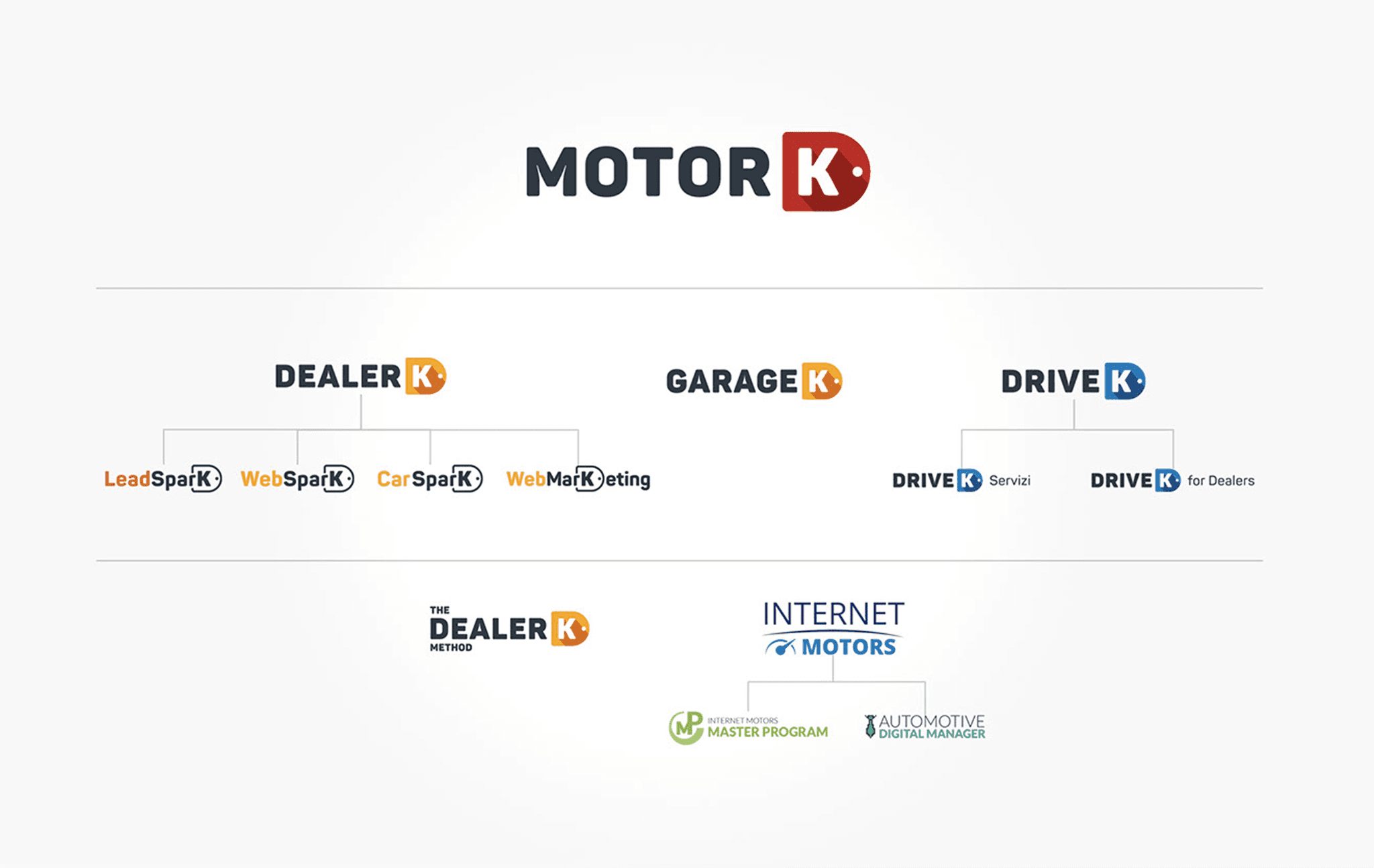
Old brand architecture
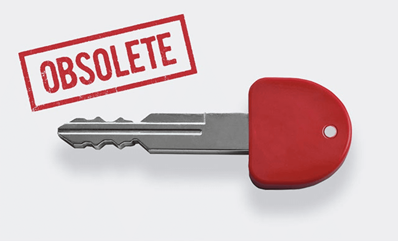
Obsolete "Key" concept
Design Process
Brand audit and positioning
We started by auditing the current brand ecosystem, across marketing, product, internal documentation, and partner-facing materials.
The insights highlighted inconsistency, legacy visuals, and a lack of distinctiveness. From there, we defined brand attributes that reflected where MotorK was going: bold, dynamic, high-performance.
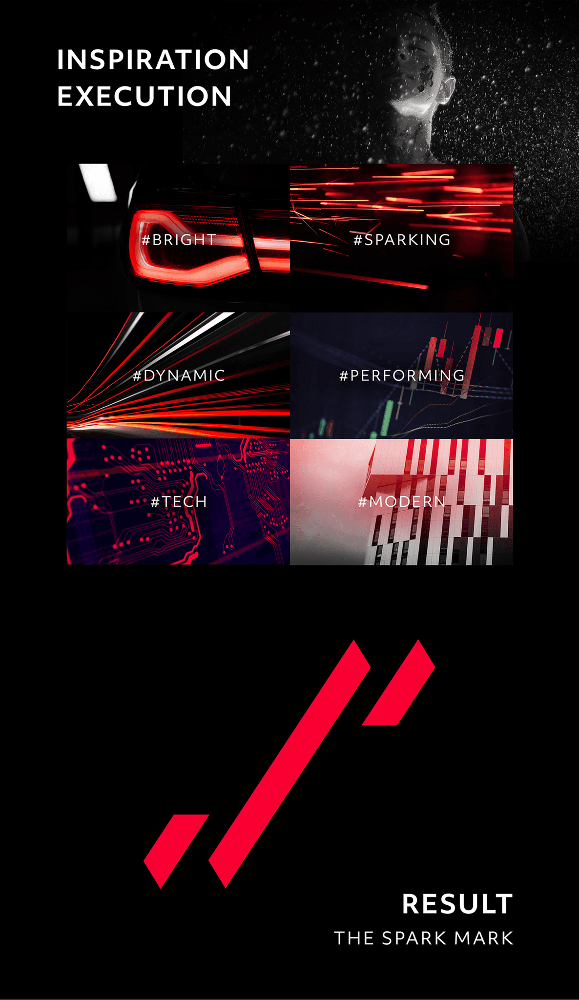
Concept exploration: The Spark
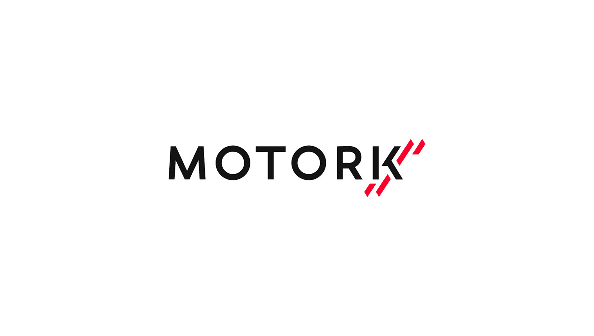
The new identity was built around a core idea: the spark, a symbol of ignition, speed, and transformation. This led to the development of the “K Spark” mark, a graphic element designed to be distinctive, expressive, and versatile across mediums.
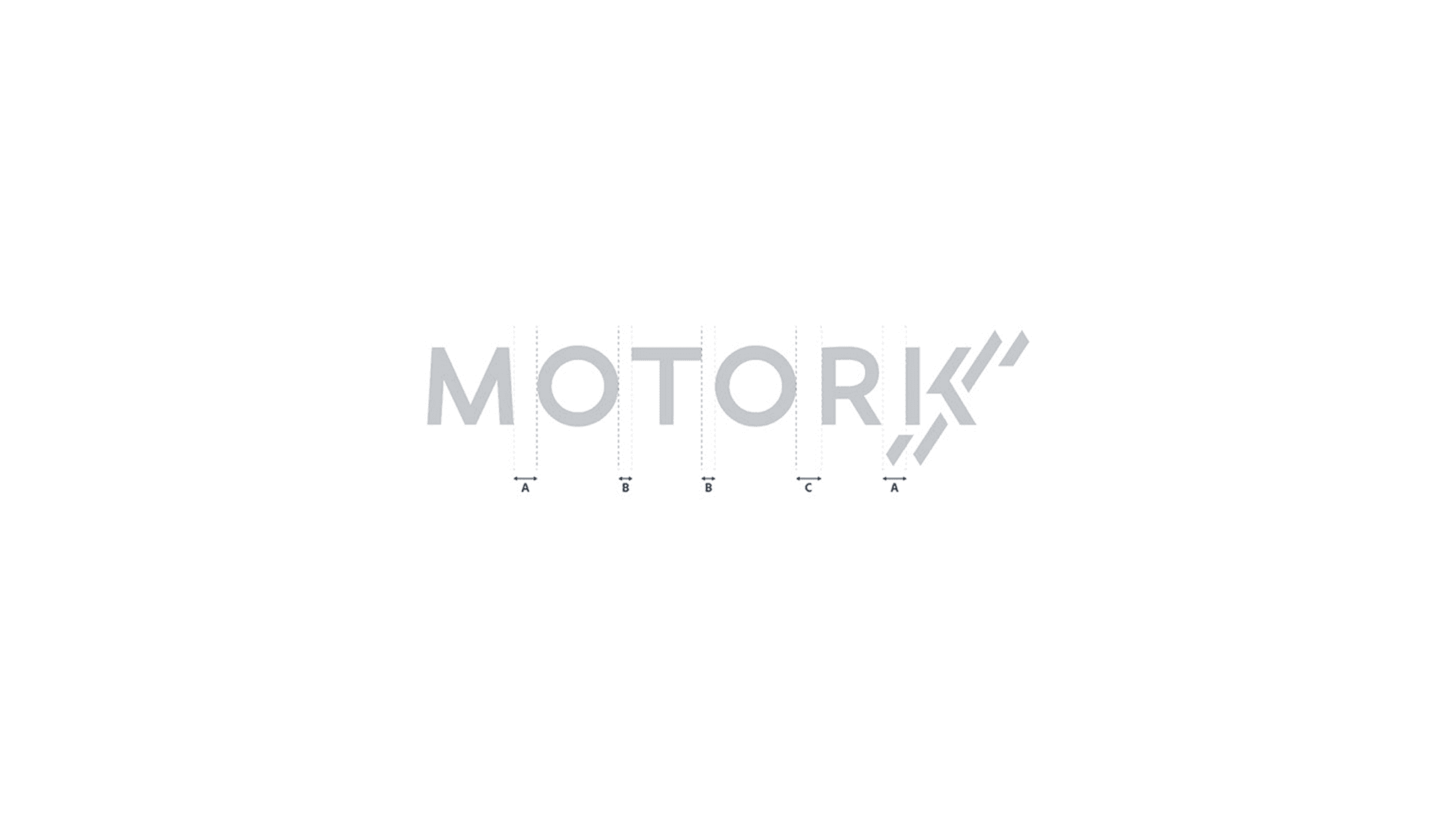
Visual language and system
We built a full visual system including:
A redesigned logotype and spark symbol
Typography, spacing, and grid standards
A renewed color palette balancing energy (reds) with precision (black/white/grays)
Iconography and UI elements aligned with the brand’s bold character
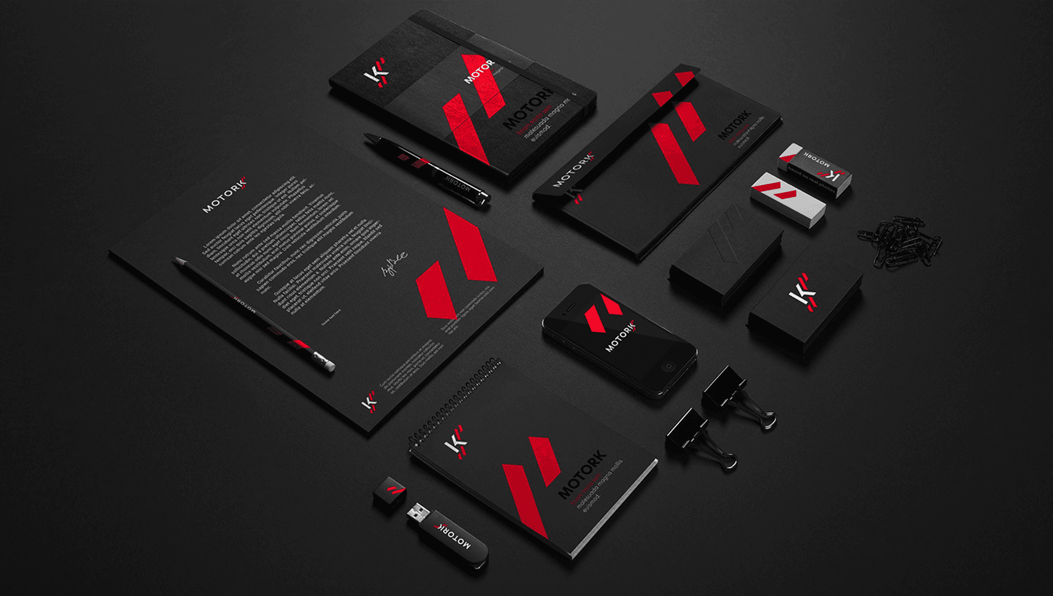
Applications across ecosystem
We applied the system across digital and physical touchpoints:
Product UI elements and mobile apps
Corporate assets and internal tools
Presentation templates and event branding
Merchandising, packaging, and signage
Transition and documentation
To support rollout, we delivered a brand kit, component libraries, and design guidelines to internal teams. The system was built for autonomy, enabling consistent execution at scale.
Results Achieved
The rebranding delivered immediate and long-term value:
Clearer brand recognition across all platforms
A strong, unified identity improved recall and cohesion across MotorK’s product suite.
Increased design and marketing efficiency
Teams could work faster with reusable assets and a shared design language.
Improved perception
Stakeholders and customers viewed the new brand as a reflection of MotorK’s innovation and leadership in the sector.
Scalability
The system provided a foundation for future product launches and acquisitions.


Lessons Learned
Rebranding is not just a creative exercise, it’s a balancing act between vision, execution, and alignment. One of the key challenges was navigating diverse stakeholder expectations. With branding being a highly visible and emotionally charged topic, finding a direction that resonated across teams required clarity, structure, and a lot of listening and iterations.
The breakthrough came in designing a solution that was simple enough to be adopted broadly, yet distinctive and expressive enough to reflect MotorK’s evolution. By anchoring the system to the “digital spark”, a concept both symbolic and flexible, we created an identity that was easy to scale, easy to use, and hard to forget.
More than a new look, the rebranding became a unifying language, one that aligned internal teams, elevated external perception, and set the tone for what comes next.
