LeadSparK - Mobile App
The automotive CRM in mobility
LeadSparK - Mobile App
Context
LeadSparK is a CRM for automotive dealerships, but its core users, sales reps on the move, were limited by a desktop-only, non-responsive platform. Without mobile access, they couldn’t manage leads, follow up, or check calendars on the go, which hurt productivity and weakened the product’s value. A dedicated mobile app became a strategic priority to close this gap and keep LeadSparK competitive in a mobile-first market.
Client
Motork
Role
UI-UX Design
Industry
Automotive
Date
2024 - 2025
Challenge
The challenge wasn’t simply about making the CRM mobile, it was about making it matter.
We needed to identify which features were truly essential in mobile contexts, redesign them for speed and clarity, and deliver a first version that felt immediately useful without overwhelming users. At the same time, the solution had to align with development constraints and ship quickly, this wasn’t a multi-year rebuild, but a focused, high-impact rollout.

Design process
To overcome this challenge, I focused on the following steps:
Focus on what matters
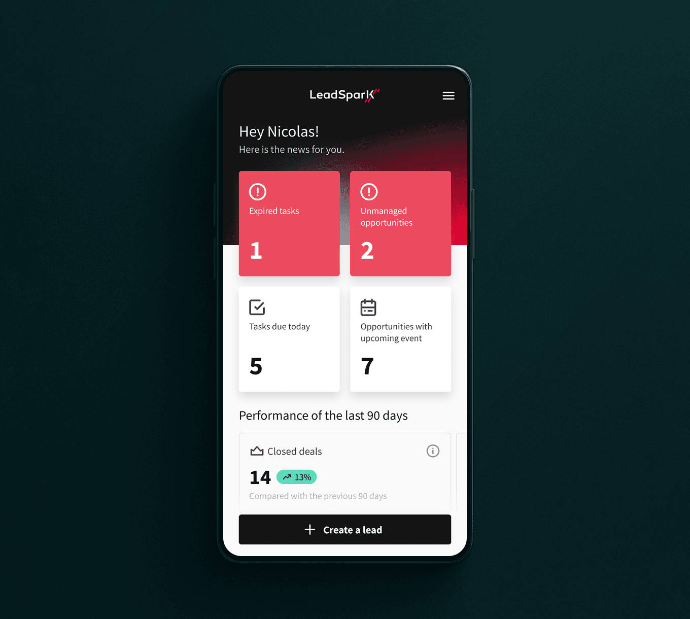
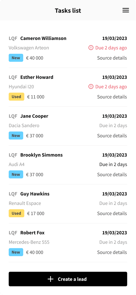
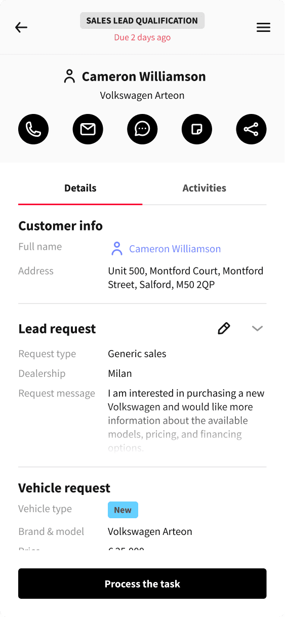
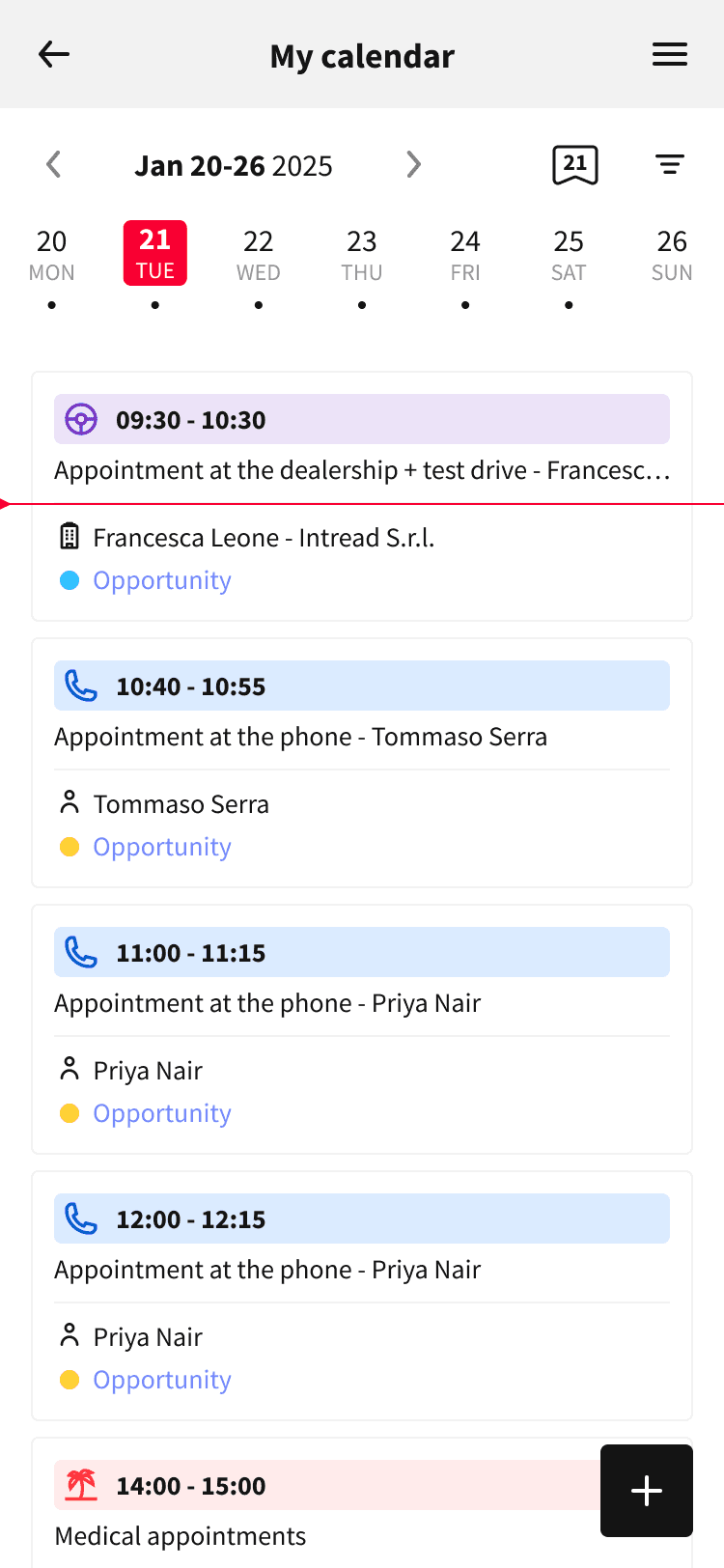
We prioritized three key use cases: lead access, task and calendar management, and contact lookup, the features sales reps needed most on the move.
Design for mobile, not smaller screens
Rather than downsizing desktop flows, we restructured interactions for mobile: simplified layouts, one-handed navigation, and fast access to critical information.
Test before building
Interactive prototypes were validated early with real users, allowing us to spot friction points and adjust before development.
Align tightly with engineering
Working closely with developers, we scoped deliverables realistically and ensured designs translated cleanly into production.
Improve post-launch
After release, we tracked usage patterns and gathered user feedback to identify pain points, then iterated to streamline workflows and improve the overall experience.
This approach allowed me to balance speed, usability, and functionality, ensuring a smooth transition from desktop to mobile.

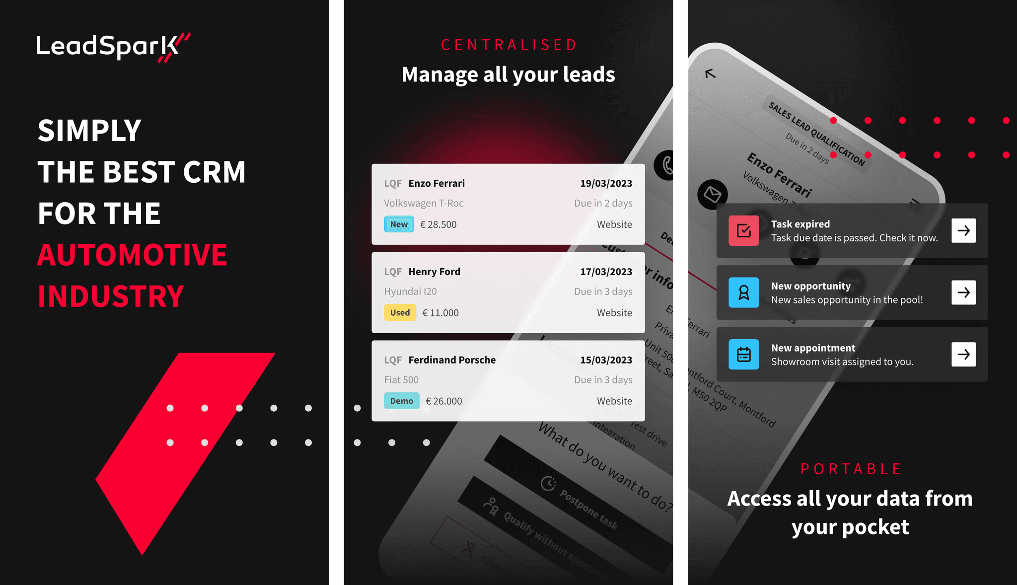
Core task flows redesigned for speed, focus, and mobile context.


Replaces the cluttered desktop view with a focused, mobile-first calendar.


Results achieved
The mobile app quickly delivered measurable improvements in both user satisfaction and engagement:
70% adoption within the first 6 months
Strong uptake confirmed the app’s value for sales reps working in the field.
Positive NPS from mobile users
Feedback highlighted faster access, improved usability, and smoother day-to-day workflows.
Lessons learned
This project reinforced a key principle: designing for mobile means designing for context, not feature parity. Early assumptions leaned toward replicating the desktop experience, but real user insights made it clear, mobile users needed focus, not completeness. By narrowing scope, validating early, and iterating post-launch, we delivered a version that felt natural in the field, not like a constrained replica.