LeadSparK - Design System
Enabling scalable, consistent product evolution
LeadSparK - Mobile App

Context
As LeadSparK evolved, the UI became increasingly fragmented. Components were duplicated, styling was inconsistent, and design decisions often varied across the platform. A legacy design system existed, but it was outdated, partial, and disconnected from the design workflow, it reflected only what was already live in production.
To support the product’s evolution, I led a full audit and rebuild of the design system. Once established, I used it to recreate in Figma the key product screens that previously existed only within the live environment. This step was essential to enable iterative prototyping, testing, and a more structured design process going forward.
Client
Motork
Role
UI & UX Design
Industry
Automotive
Date
2023 - 2025
Challenge
The challenge was twofold:
First, to clean up years of accumulated design and UI debt without disrupting ongoing development.
Second, to create a system robust enough to support both current redesign efforts and future product growth, across multiple teams, use cases, and interface types.
Leading principle
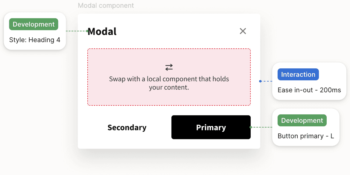
Facilitate collaboration between designers and developers through reusable components to promote efficiency and shared vision.
Atomic design based

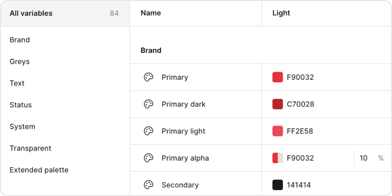
Variables and tokens driven
Documented
Design Process
Audit and mapping
The process began with a detailed audit of the existing UI across the entire product. I catalogued inconsistencies, redundant patterns, and undocumented variations. This helped define scope, expose risks, and ensure buy-in for a systemic fix.
Principles and structure
We defined guiding principles, clarity, reusability, and efficiency and structured the system following an atomic design approach. This ensured modularity and easier maintenance over time.
Foundations
I established the visual foundations:
Typography hierarchy,
Spacing and grid systems,
Color palette,
Icon set and states.
These were aligned with branding and optimized for readability and accessibility.


Component library and screen reconstruction
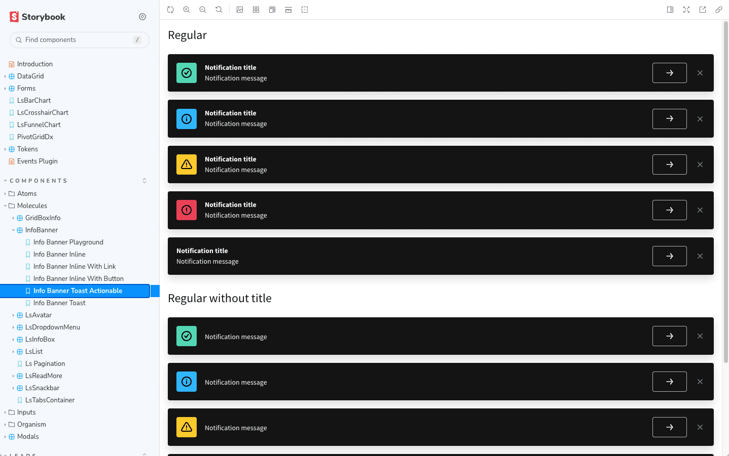
I rebuilt the entire UI kit from scratch, from buttons and alerts to complex modules like navigation, filters, and page layouts. Each component was documented, versioned, and mapped to states and variants, reducing ambiguity for developers and streamlining implementation.
Once the system was in place, I used it to recreate key product screens that had previously existed only in the live environment. This allowed the design team to shift from reactive adjustments to proactive iteration, enabling structured prototyping and faster validation of new ideas.
Integration and rollout
The system was gradually introduced into active product streams. By integrating it early into the redesign efforts, we ensured faster delivery, reduced bugs, and better cross-team alignment from design to development.
Results Achieved
The new design system delivered benefits across design velocity, product quality, and team collaboration:
Faster iteration cycles
Designers and developers worked from a shared, reliable library, reducing handoff friction.
Improved visual and interaction consistency
UI quality increased across the board, with fewer exceptions and ad hoc decisions.
Reduced front-end complexity
Reusable components streamlined implementation and minimized redundant code.
Foundation for future growth
The system became a baseline for new features, mobile interfaces, and design-led improvements.
Stronger team alignment
Designers, developers, and PMs shared a common visual language, improving communication and decision-making.
Lessons Learned
Building a design system isn’t just a visual exercise, it’s a product in itself.
This project confirmed the value of thinking in systems, not just screens. The most meaningful gains didn’t come from new components, but from consistency, clarity, and shared ownership.
By starting from real product pain and rebuilding with delivery in mind, the system became a tool for accelerating progress, not just organizing design files.